Having a new student driver in the family is stressful. You worry other drivers will be impatient, creating a dangerous and anxious environment for the person learning.
The best student driver stickers balance visibility, clarity, and personality. Use bold shapes and high-contrast colors for instant recognition. Adding humor can reduce road tension, making the learning experience safer. Place them on the bumper or rear window for maximum effect.
As a sticker expert, I’ve made thousands of student driver stickers. I can tell you they are not just simple warnings. They are communication tools. A well-designed sticker sends a clear message to other drivers: "Please be patient." This simple request can make the road a friendlier, safer place for someone who is just starting their driving journey. It’s about creating a little bit of extra space and understanding, and that can make all the difference. Let’s look at how to choose and use the perfect one.
What are the ideal shapes and types for a student driver sticker?
You know you need a sticker, but there are so many options. The wrong shape or type might not be seen, making it completely useless when you need it most.
The best shapes are simple and bold like rectangles, circles, and rhombuses for instant recognition. Die-cut stickers offer more creativity, while clear transfer stickers provide a clean, text-only look. Choose a shape based on maximum visibility and your personal style.

The shape of your sticker is the first thing another driver will notice. Your brain recognizes basic shapes very quickly, so choosing the right one is key to getting your message across fast. In my shop, we print all kinds of custom shapes, but for safety stickers, I always tell people that clarity comes first. Here are the most effective shapes and types to consider.
1.Rectangle Stickers (Bumper Stickers)
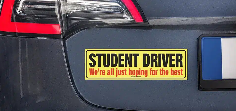
This is the classic bumper sticker format. Its large, wide surface area gives you plenty of room for big, bold text. A rectangular sticker is familiar and easy to read from a distance. It’s a no-nonsense choice that works very well for simple, direct messages like "STUDENT DRIVER" or "NEW DRIVER."
2.Circle Stickers
A circle is a friendly and eye-catching shape. It naturally draws the eye toward the center, making it great for a central message or symbol. It feels a bit softer and less aggressive than a hard-cornered rectangle. Many people choose a circle for a message that is a little more polite, like "Patience, Please."
3.Rhombus and Triangle Stickers
These shapes are universally recognized as warning signs. Your brain is conditioned to pay attention when it sees a bright yellow rhombus or a red-bordered triangle. Using these shapes for a student driver sticker taps into that built-in response. It instantly tells other drivers to be cautious and aware.
4.Die Cut Stickers
Die-cut stickers are cut to the exact shape of your design. This allows for more creativity. You could have a sticker shaped like a car, a snail, or just custom-shaped letters. While they look great, make sure the design is still simple enough to be understood quickly on the road.
5.Just Text (Clear or Transfer Stickers)
If you want a minimalist look, a transfer sticker is a perfect choice. These stickers have no background. Only the individual letters are applied to your car window or bumper. This creates a clean, professional look that seems like it's part of the car itself. It’s a great option if you don’t want a large, colorful shape on your vehicle.
| Sticker Shape | Best For | Visibility |
|---|---|---|
| Rectangle | Clear, bold text | High |
| Circle | Friendly messages | High |
| Rhombus/Triangle | Immediate warnings | Very High |
| Die Cut | Creative, custom looks | Medium |
| Just Text | Minimalist style | Medium |
What are the best design inspirations for a student driver sticker?
A boring, standard-issue sticker might get overlooked. But a design that is too distracting or hard to read can be just as bad, or even worse.
The best designs range from traditional high-contrast warnings to playful color schemes and funny quotes. Adding humor is a powerful tool. It can reduce other drivers' frustration, making the road safer and the learning experience less stressful.

The design is where you can add some personality. I've printed everything from serious warnings to hilarious jokes. A good design grabs attention and sets the right tone. It can be the difference between an annoyed driver behind you and a patient one who gives you some extra space. Here are four great design approaches.
1.Traditional Warning Stickers
This is the classic black text on a bright yellow background. It works because it is impossible to miss. The high contrast makes it readable from far away and in different lighting conditions. It's simple, direct, and universally understood. Sometimes, the most traditional design is the most effective one because there is no room for confusion.
2.Play with Colors
While yellow is the standard, don't be afraid to use other bright colors. A bright green, an electric blue, or a hot pink can be just as eye-catching. The key is to maintain high contrast between the background and the text. For example, use white text on a bright blue background. Many of my clients choose a color that matches their car, which can look great while still being visible.
3.Funny Quotes Student Driver Stickers
Humor is one of the best ways to get other drivers on your side. A funny sticker can make someone smile instead of getting angry. I've printed so many clever ones over the years. Some popular examples are:
- "Please Be Patient, I haven't had my coffee yet."
- "Student Driver. Sorry for driving so close in front of you."
- "I'm trying my best (and crying a little)."
A little bit of humor makes the student driver seem more human and relatable.
4.Incorporating Humorous Images
An image can communicate an idea faster than words. Adding a funny picture can make your sticker more memorable and effective. Think about a picture of a cartoon turtle, a snail with a driver's license, or a cat nervously gripping a steering wheel. These images quickly tell other drivers to expect a slow and cautious person behind the wheel. It’s a lighthearted way to ask for patience.
Where is the best place to put your student driver sticker?
You've designed the perfect sticker. But if you put it in the wrong place, nobody will be able to see it, and it won't do its job.
The most effective spots for a student driver sticker are the rear bumper and the rear window. These areas are directly in the line of sight for the driver behind you. Never place a sticker on the front windshield where it can block the new driver's view.

As a sticker maker, I always remind people that placement is just as important as the design itself. A great sticker in a hidden spot is useless. You need to put the message where it will be seen clearly by the people you are trying to communicate with. Here’s a breakdown of the best and worst spots.
Bumper
The bumper is a classic location. It's at a good eye level for most drivers who are following you. For this location, you must use a high-quality, weather-resistant vinyl sticker. A bumper takes a lot of abuse from rain, dirt, and sun, so you need a durable material that won't fade or peel. I always recommend adding a laminate coating for extra protection.
Rear Window
The rear window is another excellent choice. It’s higher up, so it can be seen easily by drivers in larger vehicles like trucks and SUVs. If you place a sticker here, put it in a lower corner on the driver's or passenger's side. You don't want to block the student driver's rear view. A clear sticker with colored text or a smaller die-cut sticker works very well on a window.
Windshield
This is the one place you should never put a sticker. I have to say this very clearly. Placing anything on the front windshield that is not required by law can block the driver’s view of the road. This is extremely dangerous, especially for a new driver who needs to be able to see everything. It is also illegal in many places. Safety must always be the top priority, so keep the front windshield completely clear.
Conclusion
Choosing a visible shape, a clear design, and the right placement can make learning to drive much safer. A good sticker asks for patience and makes the road a friendlier place.