Your brand's vibrant logo looks amazing on screen, but dull and flat on the printed sticker. This frustrating inconsistency makes your products look unprofessional and cheapens your brand image.
To get accurate colors, you must design in the CMYK color model, use the correct color profile for your printer, and calibrate your monitor. This ensures what you see on screen is as close as possible to the final printed result.
In my sticker printing business, "Why doesn't my sticker look like my design?" is the number one question I get. Color accuracy is everything, especially when your brand identity is on the line. What you see on screen isn't always what you get on paper because they speak two different color languages. A strong color management workflow is the key to producing stickers that match your digital designs perfectly, batch after batch. Let's walk through how we make that happen.
Should I design in RGB or CMYK for printing?
Your electric blue design looks brilliant on your monitor. But the printed sticker comes back looking like a muted, dark navy, ruining your branding and wasting your money.
Always design for printing using the CMYK color model. Screens use a wide-gamut RGB light, while printers use a more limited CMYK ink. Designing in CMYK from the start prevents major color shifts.

The most fundamental step is starting your project in the right color space. If you design in RGB and then convert to CMYK at the last minute, the software has to guess how to change those bright, luminous colors into something a printer can handle. This often leads to disappointment. I had a client who built their whole brand around a vibrant lime green they picked on screen. They sent me the RGB file, and I had to show them how that beautiful green turned into a dull, flat olive color in CMYK. By understanding the difference from the start, you can manage your expectations and choose colors that will print beautifully.
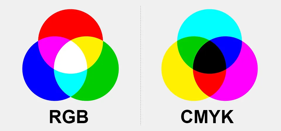
RGB vs. CMYK Color Models
Your monitor displays colors using RGB (Red, Green, Blue). It's an additive process. It starts with a black screen and adds light to create the colors you see. When all three are at full power, they make pure white light. On the other hand, printers use CMYK (Cyan, Magenta, Yellow, Key/Black). This is a subtractive process. It starts with white paper and subtracts brightness by adding ink.
Understanding Color Gamut and Limitations
The range of colors a device can create is its gamut. The RGB color gamut is much larger than the CMYK gamut. Think of RGB as a giant box of 120 crayons, including all the neons and bright metallics. CMYK is more like a standard box of 48 crayons. It has a great range, but it simply doesn't contain that neon green. When you convert from the big box to the small one, the system has to find the closest possible match, which is often a less saturated color.
What is a colour management system and why does it matter?
You print the same design file twice, but the colors look different. This unpredictability is risky for your brand and makes it impossible to guarantee a consistent product for your customers.
A color management system is a workflow that uses software and hardware to ensure color consistency from your screen to the final print. It uses specific color profiles and device calibration to make color predictable.

Think of a color management system as a universal translator for color. Every device in your workflow—your monitor and my printer—sees and reproduces color a little differently. Without a system to manage these differences, you're just guessing. At my print shop, our color management workflow is everything. It’s what allows us to print a client's order today and have it match an order they place six months from now. It removes the stress of inconsistency and turns color into a reliable science.
What is a color management system?
It’s not a single piece of software. It’s the entire process of controlling color. This involves setting up your design software (like Adobe Illustrator) correctly, using standardized profiles to define colors, and calibrating your hardware. The goal is to create a predictable environment where a specific CMYK value will look the same on your calibrated screen as it does on my press.
Color Profiles
A color profile (or ICC profile) is a small data file that describes a device's color gamut. It's like a character reference that tells other devices, "This is how I produce the color red." When you design, you must use a CMYK profile. For most work in North America, we use GRACoL 2013. I always provide my specific printer's profile to clients who need absolute precision.
Color Calibration
While a profile describes a device, calibration is the act of physically adjusting it to a known standard. For a designer, this means calibrating your monitor with a hardware tool like a colorimeter. This adjusts your screen's brightness, white point, and color to show you what the file actually looks like, not just your screen's interpretation of it. This removes the guesswork of "is my screen just too bright?"
How can you print colours that CMYK can't produce?
Your design has vibrant oranges and greens, but your CMYK proofs look muddy and dull. You feel limited by standard printing and frustrated that you can't match your on-screen vision.
To print colors outside the standard CMYK gamut, printers use an extended gamut process. This adds extra inks, such as Orange, Green, and Violet (OGV), to the press to reproduce brighter, more saturated colors.
")
This is a problem I see with brands that have a modern, digital-first aesthetic. They build their brand around a beautiful, bright color on Instagram, then find it's impossible to print using standard methods. This is where advanced printing techniques come in. The most common is the "7-color process," also known as Expanded Gamut Printing (ECG). It's how we bridge the gap between the digital and physical worlds for those hard-to-print colors.
What is the 7 color printing process?
Instead of just the four CMYK inks, the ECG process uses three additional inks to expand the achievable color range. Typically, these are Orange, Green, and Violet (OGV). These extra inks are specifically chosen to fill in the weak spots of the CMYK gamut. They allow us to hit those tricky bright greens, fiery oranges, and deep violets that were previously out of reach with standard process printing. This means we are mixing from a base of seven colors instead of four, giving us a much wider palette to work with.
Advantages and Challenges of Using Additional Inks
The main advantage is a much wider color gamut. With ECG, we can reproduce about 90% of the Pantone solid color library using just those seven process inks. This means more vibrant stickers and better brand color matching without needing a custom Pantone ink for each job. However, there are challenges. It's a more complex process that requires sophisticated software to separate the colors correctly. The setup is more demanding, so it can increase cost and complexity. It’s a premium service for jobs where color vibrancy is the absolute top priority.
What are the colour standards for printing?
Your brand has a very specific "Coke Red," but your printed stickers look slightly orange. This small variance can dilute your brand identity and make your product look like a cheap imitation.
Professionals use a spectrophotometer to measure color data and a color matching system like Pantone. The difference between a target color and a print is calculated as a Delta E (ΔE) value, which quantifies the error.

When a major brand comes to me, they don't just say "print it blue." They give me a Pantone number. That number is the standard. My job is to hit that standard exactly. We don't rely on our eyes, which can be easily fooled by lighting. We use science and standardized systems to guarantee consistency. This ensures that the sticker we print in China matches the one printed in Germany perfectly.
Spectrophotometers in Color Management
A spectrophotometer is a device that shines a controlled beam of light onto a surface and measures the exact "fingerprint" of the color that reflects off it. This gives us precise data (Lab values) for that color. It's an objective tool that isn't fooled by a dim room or a tired eye. It tells us what the color is*, not just what it looks like.
Color Comparison Using Delta E (ΔE)
We compare the spectrophotometer reading of our printed sticker to the target color data. The difference is expressed as a single number: Delta E (ΔE). Think of it as the "distance" between two colors. A ΔE of 0 is a perfect match.
| Delta E (ΔE) Value | Perceptible Difference |
|---|---|
| < 1.0 | Not perceptible by the human eye |
| 1.0 - 2.0 | Very small difference, only perceptible to a trained eye |
| 2.0 - 3.5 | A small but noticeable difference is visible to most people |
For high-quality commercial printing, we aim for a Delta E of 2.0 or less.
Pantone: A Color Matching System
The Pantone Matching System (PMS) is a standardized color recipe book. Instead of mixing CMYK inks to approximate a color, Pantone uses pre-mixed "spot" inks to create the exact color every time. When a client needs their exact brand color, using a Pantone ink is the most reliable way to guarantee it.
Conclusion
Accurate color isn't magic; it's a science. Design in CMYK, use the right profiles, and understand the tools for measuring color to achieve consistent, professional results every single time.