Skip to content
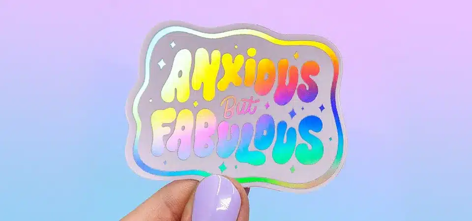
Your holographic sticker designs look muddy and the cool rainbow effect gets lost. You're spending money on a premium material, but it's not delivering that "wow" factor you wanted.
The best design tips for holographic stickers are to use white ink strategically, embrace negative space, choose bold fonts and high-contrast colors for legibility, and always get a physical sample printed before committing to a large order. It's all about balance.
As a sticker printing expert, I've seen countless holographic designs, and the most successful ones all follow the same core principles. It's about finding the perfect balance between your artwork and the material itself. You have to let the holographic film be a part of the design, not just a shiny background that you cover up. The first time I helped a client create a partial holographic sticker using a white ink layer, it was a game-changer. Their logo popped in a way they never thought possible. I'll walk you through these exact professional tips so you can achieve that vibrant, premium, and unforgettable look for your own brand.
How to design for holographic stickers?
You have this amazing holographic material, but you don't know where to start. The blank, shimmering canvas is intimidating, and you're afraid of hiding the very effect you want to showcase.
To design for holographic stickers, you should focus on high-contrast artwork. Use bold black elements and large areas of negative space (unprinted areas) to allow the rainbow effect to shine through, creating a dynamic and eye-catching final product.

Designing with the Material in Mind
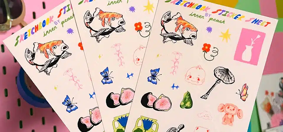
When you design for holographic vinyl, you need to think of the material as another color in your palette. It's not just a background; it's an active element. The key is contrast. The battle between the solid, printed areas and the shifting, rainbow areas is what creates visual excitement. A design that is too busy or filled with light colors will just look washed out and confusing on a holographic base. Instead, you should lean into simplicity and boldness. I always tell my clients to imagine their design in black and white first. If it has a strong silhouette and clear shapes, it will almost certainly make a fantastic holographic sticker. The holographic effect excels at filling in spaces and creating texture, so give it the room it needs to perform.
| Design Strategy | Why It Works |
|---|---|
| High Contrast | Bold black or dark colors create a stark, dramatic pop against the bright, shifting rainbow. |
| Simple Shapes | Clean lines and simple shapes are easy to read and don't compete with the complex holo pattern. |
| Negative Space | Unprinted areas become the star of the show, allowing for maximum color-shifting impact. |
Embrace white space and let the material shine?
Your holographic designs feel cluttered and the effect seems cramped and messy. Instead of looking premium and eye-catching, the sticker just looks noisy and hard to understand.
Embracing white space (or negative space) is vital because it gives the holographic effect room to catch the light. These unprinted areas create visual breathing room, making your design look cleaner and more professional.

The Power of Negative Space
Think of the holographic effect like a beautiful gemstone. To truly appreciate its fire and sparkle, you need the right setting. A cluttered setting just makes the gem look lost. In sticker design, "white space" is that setting. It refers to any part of your design that has no ink printed on it. On holographic vinyl, these unprinted areas are where the magic happens. They are where the light can hit the material unimpeded and explode into a full spectrum of color.
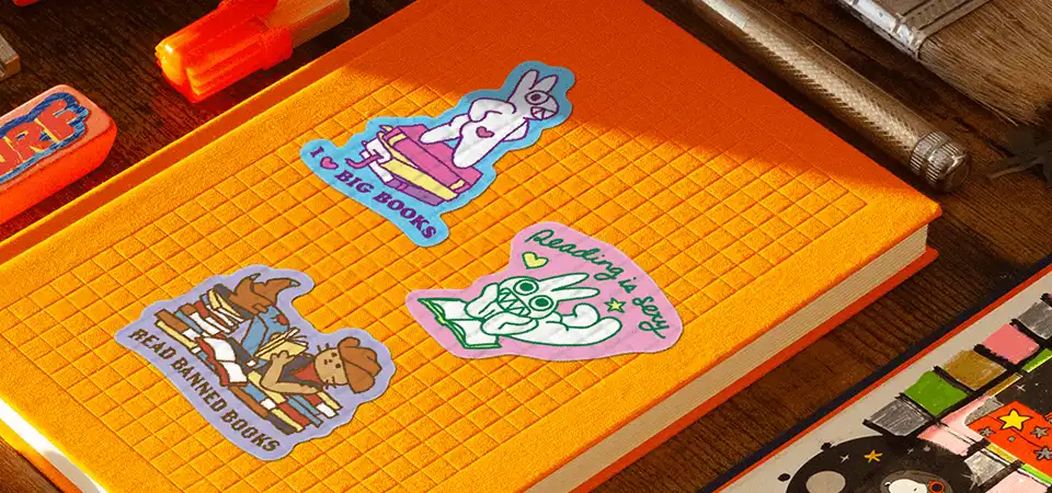
I had a client who wanted a complex floral pattern on a holographic sticker. In their first draft, every inch was covered. The result was a confusing, shimmering mess. I advised them to simplify it, using just the black outlines of the flowers and leaving the petals and background completely unprinted. The difference was night and day. The sticker went from noisy to elegant, with the holographic "petals" shimmering beautifully. Let your design breathe, and the material will reward you.
Create a partial holographic sticker or label with white ink?
You want some parts of your sticker to have opaque, solid color, while other parts show the holographic effect. You're not sure how to achieve this, so your designs are either 100% holo or not at all.
You can create a partial holographic effect by providing your printer with a white ink layer in your design file. Areas with a white ink base will print as opaque, while areas without it will appear metallic or fully holographic.

Mastering the White Ink Layer
This is the single most powerful technique for professional holographic design. A white ink layer is a special file you send to your printer along with your color artwork. It acts as a guide, telling the printer where to lay down a layer of opaque white ink before the colors are printed. This gives you complete control over the final effect. Anything printed on top of the white ink base will look like a normal, solid-color sticker. Any color printed directly onto the holographic vinyl without a white base will look metallic and shimmery. And any area with no ink at all will be pure, dazzling hologram.
This technique is essential for including things like readable barcodes, solid brand colors, or human portraits on a holographic label. Here’s a simple breakdown of how it works:
| Artwork Area | White Ink Layer | Color Layer | Final Result |
|---|---|---|---|
| Logo Text | Yes, white ink applied | Yes, blue ink applied | Opaque, solid blue text |
| Background | No white ink | No color ink | Full rainbow holographic effect |
| Accent Shape | No white ink | Yes, yellow ink applied | Metallic, shimmery yellow |
Opt for bold fonts and colours for optimum legibility?
You've printed holographic stickers, but the text and fine details are almost impossible to read. The shimmering background swallows up your message, making the sticker ineffective.
Yes, you must opt for bold, thick fonts and high-contrast colors for legibility. The reflective surface of holographic material creates visual noise that can easily obscure thin lines and light colors, so boldness is key.

Choosing Fonts and Colors That Fight Back
Legibility should always be a top priority. The shimmering, light-shifting nature of a holographic sticker is its greatest strength, but it's also a challenge for readability. The rainbow effect is constantly competing for your eye's attention. To ensure your text wins that fight, you have to make it strong.
Thin, delicate, or complex script fonts are a nightmare on holographic material. They simply disappear. You need fonts with a heavy weight—thick, solid letterforms that create a strong silhouette. Simple, sans-serif fonts are usually a safer bet than detailed serif fonts. Color contrast is just as important. Black is the undisputed king for text on a holographic background. It provides the maximum possible contrast. Dark blues, deep purples, and even solid white (printed with a white ink base) also work very well. Avoid mid-tones and light colors like yellow or light grey for text, as they will get lost in the shimmer.
Get some risk-free samples printed?
You're about to place a large order, but you're nervous that the final product won't look like the digital mockup on your screen. It's a huge financial risk to take on faith alone.
You should absolutely get samples printed. A digital mockup can never accurately show how light reflects off a holographic surface or how a laminate will change the effect. A physical sample is the only risk-free way to approve a design.

The Importance of a Physical Proof
In all my years of printing, this is the advice I give most passionately. A digital proof is great for checking spelling and layout, but it is useless for judging a holographic design. There are too many real-world variables that a computer screen cannot simulate. First, there are dozens of different holographic patterns—from the standard rainbow to crystal, sequins, or dots—and each one interacts with your design differently. Second, the finish of the protective laminate makes a huge difference. A gloss laminate will make the effect bright and intense, while a matte laminate will give it a softer, more subtle, and diffused look.
Finally, the sticker will look different under every lighting condition—from the fluorescent lights of a retail store to the direct sunlight outdoors. The only way to be 100% confident in your design is to hold it in your hand, turn it in the light, and see it for yourself. A small investment in samples can save you from a very large and costly mistake.
Conclusion
Mastering holographic design means using contrast, white space, and bold elements. Strategic use of white ink and always getting a physical sample are the secrets to creating truly unforgettable, premium stickers.